News/
Nothing in a box
The interface was redrawn after the title screen: lettering and thin lines over the world, and no boxes. The map went quiet with it, and you can jump.
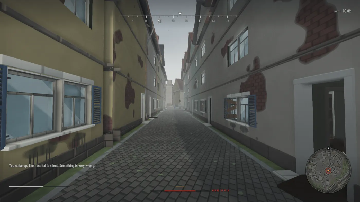
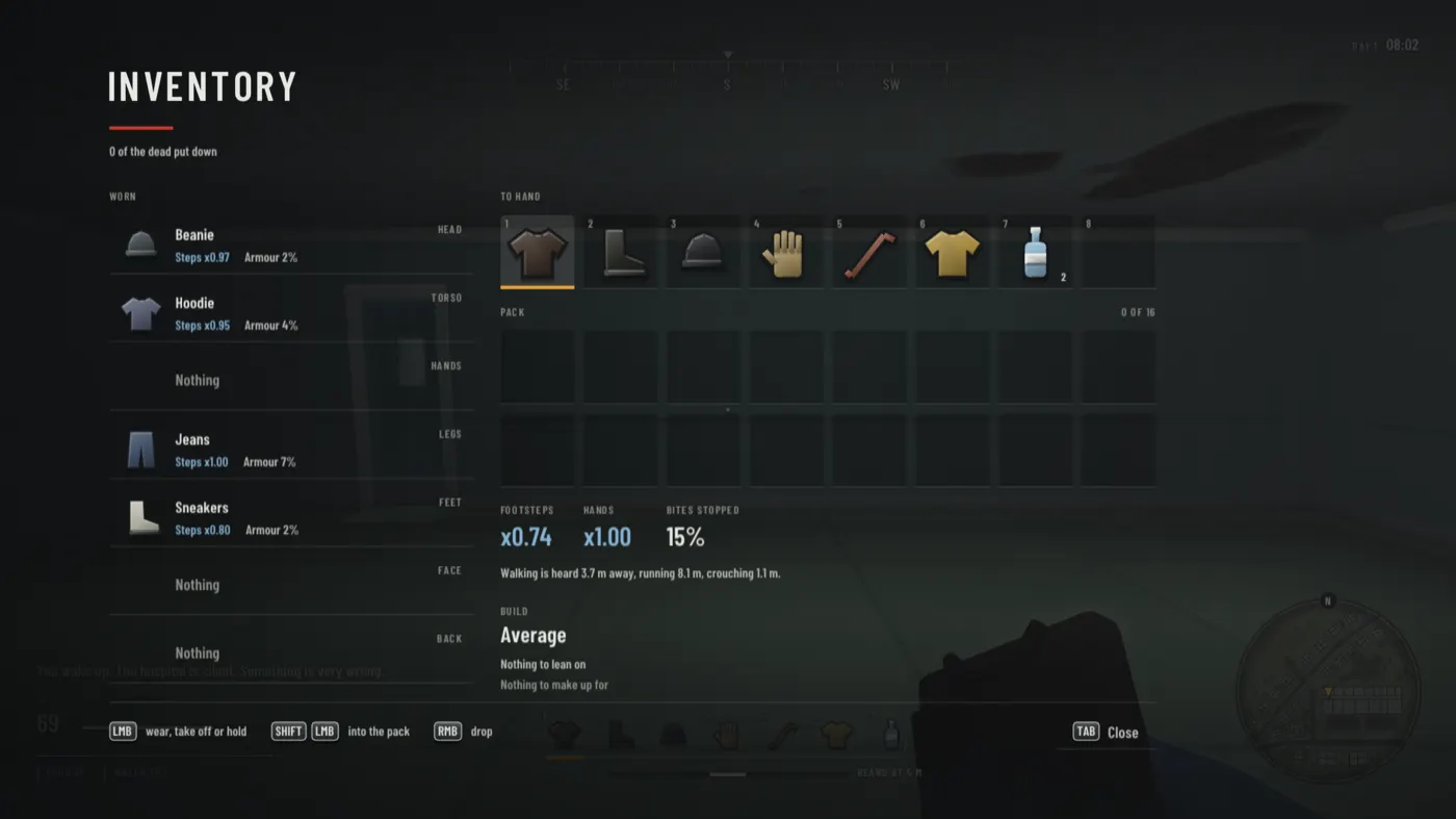
The title screen always looked right: one left edge, a few sizes of type, a bar of red under the title, an amber tick before what is chosen, and nothing in a box. The rest of the interface did not match it. Now it does.
In play
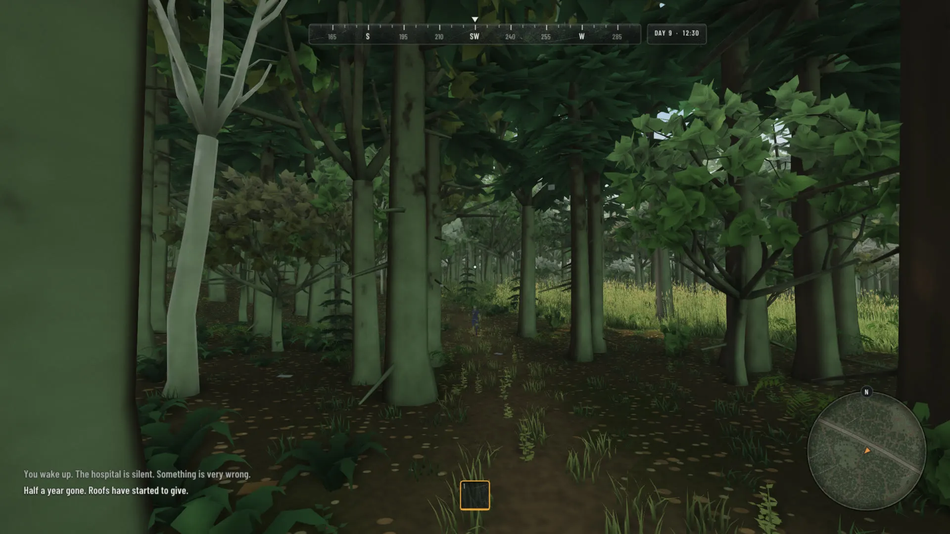
What you see while playing is lettering, figures and thin lines at the edges of the screen, with nothing behind them. The centre of the screen is the world. The line under your hands that shows how far your noise carries is chalk when you are quiet, amber when you are heard, and red when you should already be running.
Every screen a page
The inventory, the chest, building at a camp, sleeping by the fire and the pause menu are each a page laid over the world, set out the way the title screen is.
A quiet map
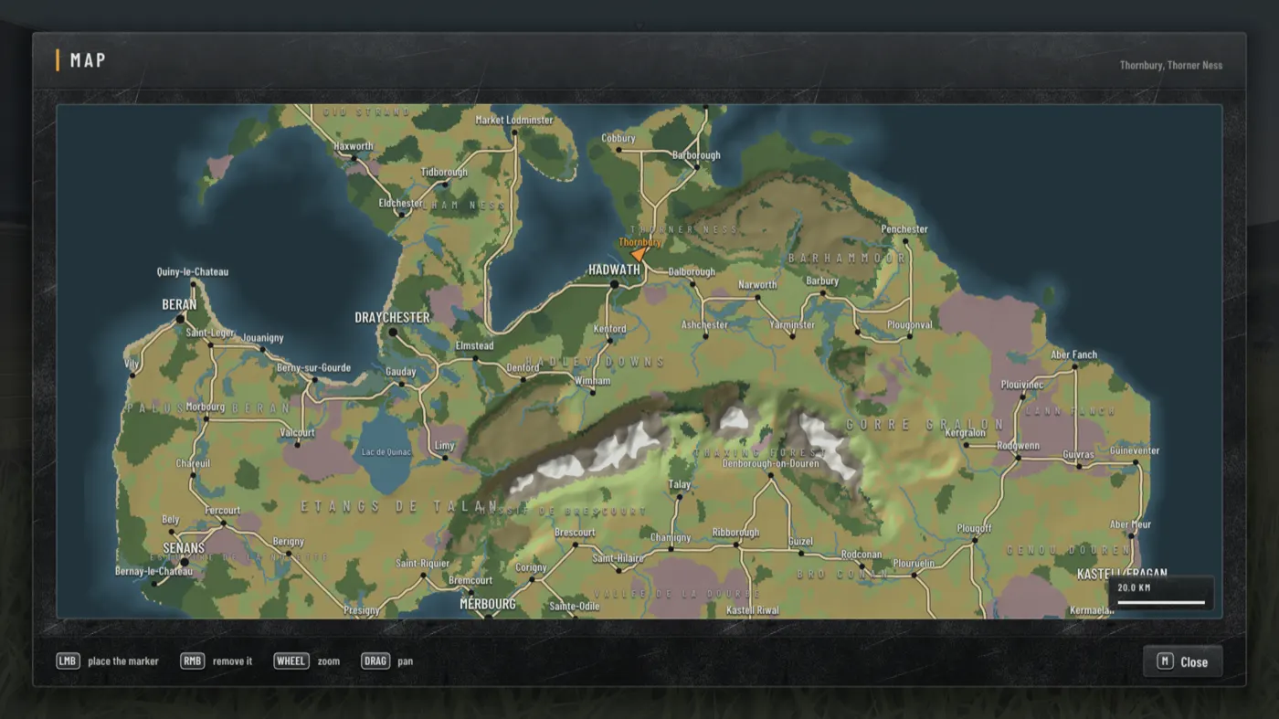
The map of the country was bright and hard-edged. It is dimmer and cooler now, one kind of country runs into the next, and it fades into the page with no line round it. Roads keep their strength, since they are what a map is read for.
And a jump
Space, on foot. Half a metre, which is what a person manages from standing. It costs breath, and it is heard: coming down carries further than a running step, and further still on tiles. Like everything else here, it is a choice about noise.